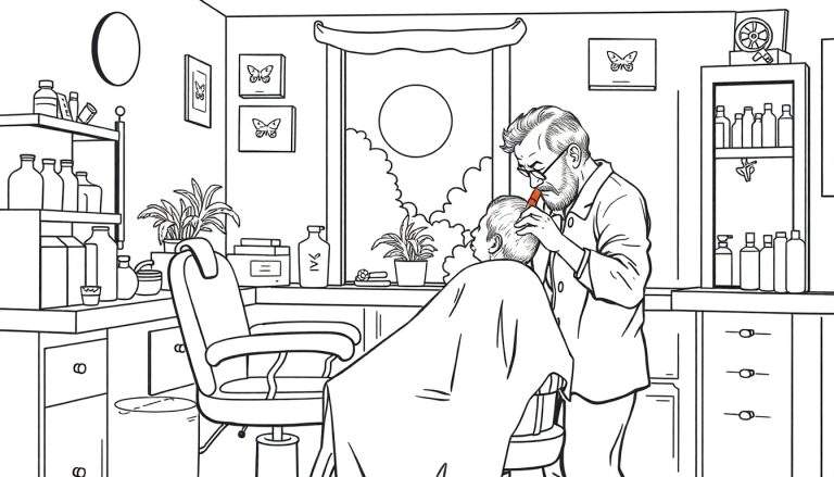
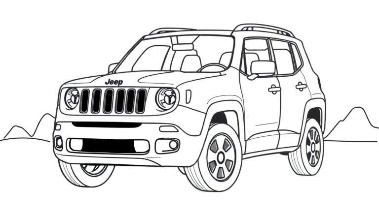
Ilustração em preto e branco de um Jeep SUV, possivelmente um Renegade, visto de trás e ligeiramente de lado, em uma estrada de terra em uma paisagem desértica. Ao fundo, montanhas e arbustos se espalham, com um sol brilhando no céu. A estrada é sinuosa, sugerindo uma aventura off-road.
Ver mais desenhos para colorir na categoria: Veículos e Transporte

Aventura Off-Road para Colorir
Esta página para colorir cativante apresenta um Jeep SUV, evocando a sensação de liberdade e exploração em um cenário desértico pitoresco. Com um Jeep posicionado em uma estrada de terra, rodeado por montanhas imponentes e vegetação rústica, esta ilustração convida os artistas de todas as idades a dar vida a esta cena de aventura.
O design detalhado do Jeep, incluindo as inscrições “Jeep” e “CAM” na traseira, juntamente com a sinuosidade da estrada de terra, adiciona um toque de realismo. O sol no céu e os arbustos espalhados criam uma atmosfera desértica vibrante, tornando esta página para colorir uma tela perfeita para a criatividade.
Um Ícone de Aventura
O Jeep é sinônimo de aventura e capacidade off-road. Desde sua origem militar na Segunda Guerra Mundial até os modelos modernos, o Jeep tem sido um companheiro confiável para exploradores e entusiastas de atividades ao ar livre. A inclusão de um modelo que se assemelha ao Jeep Renegade adiciona um toque contemporâneo a esta ilustração clássica de um veículo robusto em seu elemento natural.
Esta página para colorir oferece uma oportunidade fantástica para quem ama carros e o ar livre. É uma maneira divertida e relaxante de se conectar com a emoção de uma expedição desértica, permitindo que você imagine suas próprias paisagens coloridas e aventuras com este icônico veículo.


1.001 Responses
Across sandbox UI evaluations and ecommerce vendor prototype systems, analysts encountered structured sections featuring orchard quartz hall vendor showcase hub node within page layout, and while the quartz orchard aesthetic feels rare and visually striking, the vendor hall link redirects to the homepage which reduces usability and causes confusion during browsing analysis and testing cycles
Across sandbox UI evaluations and ecommerce vendor prototype systems, analysts encountered structured sections featuring trail harbor parlor vendor showcase node within page layout, and while the design is consistent and conceptually strong, broken navigation links severely limit usability and create frustration during user testing and system validation processes
While browsing through different online vendor hubs and marketplace listings, I came across something that felt structurally sound but visually underdeveloped, especially when seeing Walnut foundry brook vendor portal included – The walnut concept works well, but walnut wood tones in the header would enhance warmth and visual consistency.
Across UX design showcases and experimental online shop layouts, critics frequently point out areas in Crystal Cove shop gateway – while the gateway interface is intuitive and modern, the missing product content results in a paradoxical feeling of readiness without actual offerings
During an exploration of retail district platforms with clean UI design, I discovered visit upland cove retail space – The interface feels simple and well structured, making browsing comfortable and easy without distractions or confusing elements.
During research into structured craft marketplace websites, I explored explore upland harbor craft collection market – Navigation could improve, but products are unique and cool, giving the platform creative value.
During research into artisan-focused online stores with creative layouts, I explored check curated trail shop – The design feels cohesive and artistic, and browsing across pages is smooth and visually consistent.
сколько стоит размещение в СМИ размещение статьи в СМИ для бизнеса
Users exploring modern online stores frequently appreciate platforms that streamline shopping processes, and during their journey they may encounter suncove digital atelier shop showcasing structured categories and – it enhances user satisfaction through clean design and efficient product access.
During frontend evaluations of ecommerce marketplace systems and UI vendor prototypes, developers observed navigation elements containing harbor vale vendor parlor showcase access portal embedded in page flow, and although the vale harbor aesthetic feels calm and welcoming, the parlor section is completely empty which reduces engagement and usability during testing sessions
While navigating through a variety of suggested resources and hidden finds, I found something that appeared neatly arranged, especially when seeing this balanced layout – it creates a natural flow for browsing, so I might revisit it for a more detailed look.
During an online comparison of marketplace sites I noticed Harbor Kettle vendor house portal – The design is simple and cute, but multiple footer links appear to be broken, which makes the site feel incomplete and not fully ready for user interaction.
While browsing through different niche directories and discovery threads, I came across something that felt intuitive and clean, especially when seeing Honey Cove marketplace entry included – First impression is nice, with content that appears relevant and easy to read, making the overall experience smooth and uncomplicated.
Самое полезное для вас: https://bittogether.com/index.php/topic,24351.0.html
Across prototype marketplace systems and UI sandbox environments, analysts encountered embedded navigation blocks containing harbor quick market house vendor staging console hub within page layout, and although the “quick harbor” identity suggests speed, the actual load time is slow which negatively impacts usability during testing sessions
While scanning through niche commerce hubs and curated storefront listings, I came across something that looked visually appealing but lacked pricing transparency, especially where Walnut cove commerce atelier page – The atelier name feels luxurious and stylish, but the pricing structure looks random and not logically consistent across listings.
Users who frequently handle online transactions prefer systems that minimize clutter and present trading options in a visually clear and accessible format MarketLink Directory Space – This setup ensures easy navigation and helps users quickly identify relevant opportunities within the trade hall environment
ролет штора ролет штора .
As I analyzed several artisan exchange platforms for usability and content structure, I found check violet harbor artisan hub exchange – There is good variety available, and I enjoy browsing different sections without getting lost due to the simple layout.
In various discussions about experimental online shop design and conceptual UX patterns, observers point to segments like Harbor Vendor Portal Grid View which offers navigation clarity but minimal substantive catalog content underneath the surface – It feels like a lightly modified template rather than a custom build.