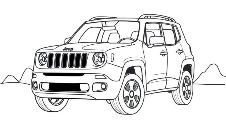
Ilustração em preto e branco de um Jeep SUV, possivelmente um Renegade, visto de trás e ligeiramente de lado, em uma estrada de terra em uma paisagem desértica. Ao fundo, montanhas e arbustos se espalham, com um sol brilhando no céu. A estrada é sinuosa, sugerindo uma aventura off-road.
Ver mais desenhos para colorir na categoria: Veículos e Transporte

Aventura Off-Road para Colorir
Esta página para colorir cativante apresenta um Jeep SUV, evocando a sensação de liberdade e exploração em um cenário desértico pitoresco. Com um Jeep posicionado em uma estrada de terra, rodeado por montanhas imponentes e vegetação rústica, esta ilustração convida os artistas de todas as idades a dar vida a esta cena de aventura.
O design detalhado do Jeep, incluindo as inscrições “Jeep” e “CAM” na traseira, juntamente com a sinuosidade da estrada de terra, adiciona um toque de realismo. O sol no céu e os arbustos espalhados criam uma atmosfera desértica vibrante, tornando esta página para colorir uma tela perfeita para a criatividade.
Um Ícone de Aventura
O Jeep é sinônimo de aventura e capacidade off-road. Desde sua origem militar na Segunda Guerra Mundial até os modelos modernos, o Jeep tem sido um companheiro confiável para exploradores e entusiastas de atividades ao ar livre. A inclusão de um modelo que se assemelha ao Jeep Renegade adiciona um toque contemporâneo a esta ilustração clássica de um veículo robusto em seu elemento natural.
Esta página para colorir oferece uma oportunidade fantástica para quem ama carros e o ar livre. É uma maneira divertida e relaxante de se conectar com a emoção de uma expedição desértica, permitindo que você imagine suas próprias paisagens coloridas e aventuras com este icônico veículo.


990 Responses
рулонная штора цена elektricheskie-rulonnye-shtory90.ru .
While testing staging ecommerce platforms with ember themed marketplace systems, analysts identified a content block featuring meadow market ember parlor gateway node integrated into page flow, and despite the warm design language, the long multi word naming structure feels unnecessarily complex and reduces readability during usability testing sessions and interface reviews
рольшторы заказать elektricheskie-rulonnye-shtory.ru .
Подробности по ссылке: https://www.kinofilms.ua/forum/t/5225436/
Online users looking for streamlined shopping experiences often choose platforms that offer organized layouts and curated selections that make browsing easier and more enjoyable suncove curated goods arena – This digital marketplace provides a user friendly environment where carefully selected products are displayed in a clear and efficient browsing structure.
During research into creative and organized vendor platforms, I explored browse lavender creative hub – The design is smooth and visually consistent, and browsing feels easy and enjoyable throughout the site.
While browsing through multiple online marketplace hubs and vendor listings, I found something that felt almost the same as an earlier entry, especially where Walnut cove vendor atelier commerce hub appeared – The resemblance is so close that it raises the possibility they are connected or simply replicated designs with minor variations.
While testing different craft emporium platforms and evaluating mobile usability and checkout experience, I came across explore vale harbor craft emporium – The site works well on phone, and the checkout process was smooth and fast today without any issues.
As I explored different online directories and curated resource threads, I came across something that felt structured and intuitive, particularly with Meadow honey access link – I enjoyed looking around here overall, because the layout is neat and user friendly, making browsing feel quick and comfortable.
While analyzing sandbox ecommerce marketplaces and UI vendor directory systems, testers identified embedded sections containing quick ridge house vendor market showcase entry node integrated into page hierarchy, and although it is faster than earlier baseline systems, the improvement is not significant enough which impacts usability testing outcomes
During a casual review of marketplace hubs and vendor listings, I came across a site with strong branding but minimal supporting content, particularly Harbor Aurora commerce vendor hall portal – The Aurora name is attractive, though the content feels somewhat thin and basic.
While going through multiple online listings and niche recommendations, I came across something that seemed worth noting, especially when encountering this e-commerce resource – it gives a helpful impression overall, so I may revisit it later to explore it further.
As part of studying online artisan marketplaces, I explored check this orchard mint bazaar – The structure is reliable and clean, and the overall browsing experience feels smooth and positive from start to finish.
Digital trade platforms continue to evolve as users demand more transparent listing systems that highlight vendors, services, and marketplace credibility in a single accessible interface trade hall navigator – This navigation-focused structure helps users move through listings effortlessly while maintaining clarity and reducing time spent searching for relevant trade connections
During frontend evaluations of ecommerce marketplace systems and vendor UI prototypes, developers observed navigation elements containing meadow orchard market vendor checkout parlor access console embedded in page flow, and although the orchard meadow branding feels sweet and welcoming, the checkout page consistently returns a 404 error which disrupts conversion testing and user experience analysis sessions
During exploration of template-driven ecommerce systems and drag-and-drop storefront builders, it is common to encounter pages like daisy marketplace corner where frontend design appears complete but backend integration remains inconsistent, especially in automated email signup features and data submission endpoints – The design looks cohesive yet signup functionality frequently breaks with server errors
Users who enjoy browsing modern e commerce stores typically value platforms that prioritize speed, clarity, and structured product presentation teal atelier commerce view delivering fast loading pages and simplified navigation tools that enhance usability and support seamless exploration of multiple product categories.
While scanning through online trading marketplaces and foundry-style vendor pages, I came across something that looked visually creative but technically flawed on mobile, especially where Wave brook foundry trading page – The wave design is attractive and fresh, but the mobile menu appears broken and difficult to interact with today.
Полная версия по ссылке: https://forum.i.ua/topic/27755
Доставка свежих цветов в день заказа. Флористы собирают букеты из проверенных поставок, бережно упаковывают и передают курьеру. Работаем ежедневно, гарантируем сохранность и точное время вручения. Анонимная отправка и фотоотчёт включены https://buketico.ru/